The Fleur de Lis logo: keep, lose, change-to-what?
Page 3 of 3 •  1, 2, 3
Should we lose, keep, or change the fleur as our logo?
Re: The Fleur de Lis logo: keep, lose, change-to-what?
![]() by GrayJim Sat Feb 08, 2014 11:21 am
by GrayJim Sat Feb 08, 2014 11:21 am
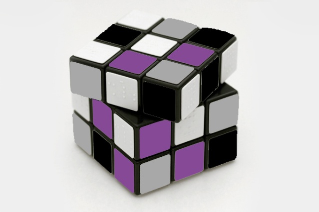
As for the Cube, I'm thinking 3/4 top-down view, with black, gray, purple, and white on the squares. If anyone is a Photoshop wizard, I imagine it would easy to do. It would be difficult doing it by hand.

GrayJim- Member
- Posts : 8
Join date : 2014-02-08
Age : 43
Location : Detroit, MI -

Re: The Fleur de Lis logo: keep, lose, change-to-what?
![]() by Halfling Sat Feb 08, 2014 11:25 am
by Halfling Sat Feb 08, 2014 11:25 am
Halfling- Conversationalist
- Posts : 176
Join date : 2013-01-31
Location : France
Re: The Fleur de Lis logo: keep, lose, change-to-what?
![]() by GrayJim Sat Feb 08, 2014 11:36 am
by GrayJim Sat Feb 08, 2014 11:36 am
GrayJim- Member
- Posts : 8
Join date : 2014-02-08
Age : 43
Location : Detroit, MI -
Re: The Fleur de Lis logo: keep, lose, change-to-what?
![]() by Halfling Sat Feb 08, 2014 11:45 am
by Halfling Sat Feb 08, 2014 11:45 am
I like the rubik's cube idea as it gets the idea of the possible evolution of things, variety of combinations, and also a kind of complexity.
Ok for the ace of spade, I didn't know what "swirl" meant, that's why I was confused. (english isn't my mother langage)
edit : oh and I love the fact that the picture I used is one of a rubik's cube for blind people.
Halfling- Conversationalist
- Posts : 176
Join date : 2013-01-31
Location : France
Re: The Fleur de Lis logo: keep, lose, change-to-what?
![]() by GrayJim Sat Feb 08, 2014 11:50 am
by GrayJim Sat Feb 08, 2014 11:50 am
By swirl I mean ribbons of gray, black, purple, and white 'swirling' around inside the boundaries of the spade shape, like if you took a paintbrush and 'swirled' the different colors of paint around so that they overlapped and blended in certain areas, but remained separate in others. It's difficult to explain in words. I need to get some purple paint and take a stab at it myself.
GrayJim- Member
- Posts : 8
Join date : 2014-02-08
Age : 43
Location : Detroit, MI -
Re: The Fleur de Lis logo: keep, lose, change-to-what?
![]() by Halfling Sat Feb 08, 2014 1:40 pm
by Halfling Sat Feb 08, 2014 1:40 pm
Halfling- Conversationalist
- Posts : 176
Join date : 2013-01-31
Location : France
Re: The Fleur de Lis logo: keep, lose, change-to-what?
![]() by GrayJim Sat Feb 08, 2014 2:41 pm
by GrayJim Sat Feb 08, 2014 2:41 pm
GrayJim- Member
- Posts : 8
Join date : 2014-02-08
Age : 43
Location : Detroit, MI -
Re: The Fleur de Lis logo: keep, lose, change-to-what?
![]() by Halfling Sat Feb 08, 2014 4:50 pm
by Halfling Sat Feb 08, 2014 4:50 pm
https://i.servimg.com/u/f55/11/87/28/36/rubiks10.jpg
Halfling- Conversationalist
- Posts : 176
Join date : 2013-01-31
Location : France
Re: The Fleur de Lis logo: keep, lose, change-to-what?
![]() by GrayJim Sat Feb 08, 2014 6:34 pm
by GrayJim Sat Feb 08, 2014 6:34 pm
GrayJim- Member
- Posts : 8
Join date : 2014-02-08
Age : 43
Location : Detroit, MI -
Re: The Fleur de Lis logo: keep, lose, change-to-what?
![]() by Aisling Fri Feb 14, 2014 10:28 am
by Aisling Fri Feb 14, 2014 10:28 am

Aisling- Admin

- Posts : 334
Join date : 2011-08-28
Location : Illinois
Re: The Fleur de Lis logo: keep, lose, change-to-what?
![]() by Halfling Fri Feb 14, 2014 11:43 am
by Halfling Fri Feb 14, 2014 11:43 am
Halfling- Conversationalist
- Posts : 176
Join date : 2013-01-31
Location : France
Re: The Fleur de Lis logo: keep, lose, change-to-what?
![]() by Alowishes Thu Feb 27, 2014 9:54 pm
by Alowishes Thu Feb 27, 2014 9:54 pm
While the rubik's cube is a great theoretical concept, it seems to focus too much on the wide range of unique attributes within the community and not enough on the main idea. I mean, it's kind of rhetorical.
However while I quite like the stripes, I can understand why others may not like them at all. Stripes are everywhere, it starts to get mundane and all the flags begin to muddy together. So! Unless this has already been suggested (I'm on mobile, it isn't easy navigating around, sorry! :c ) what about considering that the fleur be split vertically - one side black one side white - with a gray border, on a purple background? Or other options I can sketch up tonight and upload
Or even make the fleur solid gray with a purple border? It certainly wouldn't be as busy as the current symbol and in effect would be easier to recreate
Alowishes- Active Member
- Posts : 13
Join date : 2014-02-27
Age : 32
Location : Los Angeles
Re: The Fleur de Lis logo: keep, lose, change-to-what?
![]() by Alowishes Thu Feb 27, 2014 10:04 pm
by Alowishes Thu Feb 27, 2014 10:04 pm
Halfling wrote:The image isn't made for being a new logo or whatever, it's just used to illustrate what could be done... I didn't remove any copyright written on the picture, which was downloadable so it can't be "copyrighted"... o_O Plus, it's not an art related picture (which would get an author right). It's like taking on internet a picture of a car and editing it to change its color and all, if it's not a personnal image or one of an artist, it doesn't get any copyright, does it ?!
Just because something can be downloaded, doesn't mean it isn't copyrighted. I'm not 100% sure about using the image of a Rubik's cube because the item is already iconic of the brand anyway. For example, if your logo contains... a box of tissues, no one would be able to determine (let alone prove) that the box of tissues is speficially Kleenex or Puffs, and thus you won't need to worry about running into legal issues. But because something like a Rubik's is only made by one company and is so iconic of that brand, there is little opportunity to try to put a spin on said icon/logo without it being recognized as a Rubik's cube.
Alowishes- Active Member
- Posts : 13
Join date : 2014-02-27
Age : 32
Location : Los Angeles
Re: The Fleur de Lis logo: keep, lose, change-to-what?
![]() by Aisling Thu Feb 27, 2014 10:46 pm
by Aisling Thu Feb 27, 2014 10:46 pm
= accurate and the main source of concern here over the use of that image base.Alowishes' post
Aisling- Admin
- Posts : 334
Join date : 2011-08-28
Location : Illinois
Re: The Fleur de Lis logo: keep, lose, change-to-what?
![]() by Alowishes Fri Feb 28, 2014 2:36 am
by Alowishes Fri Feb 28, 2014 2:36 am
Alowishes wrote:
However while I quite like the stripes, I can understand why others may not like them at all. Stripes are everywhere, it starts to get mundane and all the flags begin to muddy together. So! Unless this has already been suggested (I'm on mobile, it isn't easy navigating around, sorry! :c ) what about considering that the fleur be split vertically - one side black one side white - with a gray border, on a purple background? Or other options I can sketch up tonight and upload
Or even make the fleur solid gray with a purple border? It certainly wouldn't be as busy as the current symbol and in effect would be easier to recreate
Ack
Alowishes- Active Member
- Posts : 13
Join date : 2014-02-27
Age : 32
Location : Los Angeles
Re: The Fleur de Lis logo: keep, lose, change-to-what?
![]() by Aisling Fri Feb 28, 2014 2:38 am
by Aisling Fri Feb 28, 2014 2:38 am
Aisling- Admin
- Posts : 334
Join date : 2011-08-28
Location : Illinois
Re: The Fleur de Lis logo: keep, lose, change-to-what?
![]() by Alowishes Fri Feb 28, 2014 3:09 am
by Alowishes Fri Feb 28, 2014 3:09 am
Haha
For the community's consideration, I came up with this for the forum in specfic. "DG" gave a perfect opportunity I couldn't pass up and came up with this: www.glowstickminuet.tumblr.com/post/78088622296 this is super rough, but I thought if the fleur logo stays, this is a great way to be subtle yet specific for DG.
And here's what I suggested in my first post
Pardon my excitement xD I design for a living so to at least participate even in a long-existing thread debate for a logo is a lot of fun!
Alowishes- Active Member
- Posts : 13
Join date : 2014-02-27
Age : 32
Location : Los Angeles
Re: The Fleur de Lis logo: keep, lose, change-to-what?
![]() by Aisling Fri Feb 28, 2014 3:15 am
by Aisling Fri Feb 28, 2014 3:15 am
Aisling- Admin
- Posts : 334
Join date : 2011-08-28
Location : Illinois
Re: The Fleur de Lis logo: keep, lose, change-to-what?
![]() by Halfling Fri Feb 28, 2014 9:31 am
by Halfling Fri Feb 28, 2014 9:31 am
Posting the modified picture here isn't something I'm try to get money from, or anything like that. Do you think a company like Rubik's would come here and claim for compensation.... I guess they've better things to do. But if you're unconfortable to let it posted here, you can put it away, it's your right as an admin here and I really don't care, as far I'm concerned ^^'.
Halfling- Conversationalist
- Posts : 176
Join date : 2013-01-31
Location : France
Re: The Fleur de Lis logo: keep, lose, change-to-what?
![]() by Aisling Fri Feb 28, 2014 1:54 pm
by Aisling Fri Feb 28, 2014 1:54 pm
I don't get why you keep reacting as the picture would be used as an actual logo
Because that is the entire point of this thread, and you depicted the cube image as a potential logo for representing either the forum or the community as a whole.
Nobody was upset about you posting the pic; you're misunderstanding the discussion, if that is what you are assuming. We are simply clarifying that, nice image or not, it won't really be viable for use as a forum logo here.
Aisling- Admin
- Posts : 334
Join date : 2011-08-28
Location : Illinois
Re: The Fleur de Lis logo: keep, lose, change-to-what?
![]() by Halfling Sat Mar 01, 2014 7:02 am
by Halfling Sat Mar 01, 2014 7:02 am
Halfling- Conversationalist
- Posts : 176
Join date : 2013-01-31
Location : France
Re: The Fleur de Lis logo: keep, lose, change-to-what?
![]() by Aisling Sat Mar 01, 2014 7:16 am
by Aisling Sat Mar 01, 2014 7:16 am
Aisling- Admin
- Posts : 334
Join date : 2011-08-28
Location : Illinois
Re: The Fleur de Lis logo: keep, lose, change-to-what?
![]() by Storm Sun Nov 23, 2014 6:18 pm
by Storm Sun Nov 23, 2014 6:18 pm
Beauty, strength, power, love, life, light.
Uncertain origins, unisex, ancient and traditional yet new and classicly stylized. Hotly debated and not totally understood clearly even by those who have studied it's origins.
To be honest. It sounds a lot like us.
Keep it, it looks great
Storm- Lurker
- Posts : 3
Join date : 2014-11-23
Re: The Fleur de Lis logo: keep, lose, change-to-what?
![]() by Dimitri Tue Jul 07, 2015 6:15 am
by Dimitri Tue Jul 07, 2015 6:15 am
rainingsand wrote:
Something like this? I mean, probably more polished, but generally?
Yes! I approve of this.
When I first found this site I thought the fleur-de-lis symbol was cool, but not really approptiate? Makes me think about France all the time.. not so much about demi
And the AVEN triangle DOES have a holocaust vibe to it..
Dimitri- Lurker
- Posts : 2
Join date : 2015-07-01
Page 3 of 3 • 1, 2, 3
|
|
|