Feedback, Suggestions, and Commentary on the forum setup
+2
Faelights
Aisling
6 posters
Page 2 of 2
Page 2 of 2 •  1, 2
1, 2
Re: Feedback, Suggestions, and Commentary on the forum setup
![]() by Arcanine Fri Sep 02, 2011 1:33 am
by Arcanine Fri Sep 02, 2011 1:33 am
I like this new look  I'd say that the only issue that really sticks out here, is the logo. I'm not sure how this could be fixed, maybe a tranparent background? :O
Though apart from the logo I think it looks great, and I like that we have a quick reply now
Though apart from the logo I think it looks great, and I like that we have a quick reply now

Arcanine- Moderator

- Posts : 32
Join date : 2011-08-29
Age : 31
Location : Antarctica
Re: Feedback, Suggestions, and Commentary on the forum setup
![]() by Aisling Fri Sep 02, 2011 1:35 am
by Aisling Fri Sep 02, 2011 1:35 am
:] Thanks, Arca! Yeah... I'm working on a new logo, but it does take time. XD
If ANYBODY has an image they think is worth considering, I welcome them to post it. I'm a great editor-by-way-of-gIMP, but I'm not the only person here with the ability to have ideas. XD
If ANYBODY has an image they think is worth considering, I welcome them to post it. I'm a great editor-by-way-of-gIMP, but I'm not the only person here with the ability to have ideas. XD

Aisling- Admin

- Posts : 334
Join date : 2011-08-28
Location : Illinois
Re: Feedback, Suggestions, and Commentary on the forum setup
![]() by Aisling Fri Sep 02, 2011 2:51 am
by Aisling Fri Sep 02, 2011 2:51 am
Another double-post:
I've massively re-done the banner icon.
Opinions?
(This is something like the twentieth version, after a craptonne of adjustments and fixes.)
I've massively re-done the banner icon.
Opinions?
(This is something like the twentieth version, after a craptonne of adjustments and fixes.
Aisling- Admin
- Posts : 334
Join date : 2011-08-28
Location : Illinois
Re: Feedback, Suggestions, and Commentary on the forum setup
![]() by Aisling Fri Sep 02, 2011 3:33 am
by Aisling Fri Sep 02, 2011 3:33 am
Triple-post! Going for a record, Tegid? XD
Anyway, if you like the current icon, thank Rabbit, who found the higher-resolution font.
XD Also thank me, because I did the rest. haha
Anyway, if you like the current icon, thank Rabbit, who found the higher-resolution font.
XD Also thank me, because I did the rest. haha
Aisling- Admin
- Posts : 334
Join date : 2011-08-28
Location : Illinois
Re: Feedback, Suggestions, and Commentary on the forum setup
![]() by Torraed Fri Sep 02, 2011 3:46 pm
by Torraed Fri Sep 02, 2011 3:46 pm
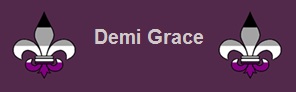
Really liking the new phpBB setup. ^_^ I like the look of the fleur de lis/luce, but I've gotta say, the contrasting fading effects of the header background and text make it kinda hard to read.
Anyway, I was messing around a bit with the logo/header last night and it looks like our concepts turned out to be rather similar. I figured I'd post a couple here to see what y'all think. (Actually, these two are both the same design, but with different background colors. I think I like the purple one, personally.) So again, just dumping my ideas; take 'em or leave 'em.


I'm not entirely sure how the coding and setting up of the header works, but in the event that people do like either of these, the background color codes are #696969 (grey) and #4A1C4A (purple) for reference.
Anyway, I was messing around a bit with the logo/header last night and it looks like our concepts turned out to be rather similar. I figured I'd post a couple here to see what y'all think. (Actually, these two are both the same design, but with different background colors. I think I like the purple one, personally.) So again, just dumping my ideas; take 'em or leave 'em.
I'm not entirely sure how the coding and setting up of the header works, but in the event that people do like either of these, the background color codes are #696969 (grey) and #4A1C4A (purple) for reference.
Last edited by Torraed on Fri Sep 02, 2011 5:01 pm; edited 1 time in total

Torraed- Active Member
- Posts : 14
Join date : 2011-08-29
Age : 209
Location : Northeast -

Re: Feedback, Suggestions, and Commentary on the forum setup
![]() by ratherdrinktea Fri Sep 02, 2011 4:08 pm
by ratherdrinktea Fri Sep 02, 2011 4:08 pm
Oooh! The second one Torr posted is pretty.
I don't really like the current banner much for some reason
I don't really like the current banner much for some reason

ratherdrinktea- Visibility Specialist

- Posts : 38
Join date : 2011-08-29
Re: Feedback, Suggestions, and Commentary on the forum setup
![]() by mel Sat Sep 03, 2011 9:04 am
by mel Sat Sep 03, 2011 9:04 am
ratherdrinktea wrote:Oooh! The second one Torr posted is pretty.
I don't really like the current banner much for some reason
I'm not a big fan of the bevel on the Fleur, looks very "sharp", like it would hurt me if i poked it..and the font is difficult to read and too "tall". I wasn't going to say much until I was ready to pull out photoshop and try my hand at it myself, but as long as people are commenting I figured I'd might as well throw my two-cents in.
mel- Conversationalist
- Posts : 70
Join date : 2011-08-30 -
Re: Feedback, Suggestions, and Commentary on the forum setup
![]() by Torraed Sun Sep 04, 2011 1:22 pm
by Torraed Sun Sep 04, 2011 1:22 pm
Faelights wrote:Oh, and yay for having links at the bottom of the page that let you go up a forum. It's even better than having a "Back to Top" button.
Fae, I just noticed that there are actually several "Back to Top" buttons on the page - they're the little dotted upward-pointing arrowheads. There's one in the bottom left-hand corner of the page, above where it says, "Quick Reply," and there's one in the bottom right-hand corner of each individual post (along with a "down" button). It took me a while to build up the curiosity to click on the arrows and figure that out, so I'm not surprised no one else has noticed it yet. =P
Torraed- Active Member
- Posts : 14
Join date : 2011-08-29
Age : 209
Location : Northeast -
Re: Feedback, Suggestions, and Commentary on the forum setup
![]() by Faelights Mon Sep 05, 2011 12:57 am
by Faelights Mon Sep 05, 2011 12:57 am
Were there similar things in the layout from before??? o_O Cuz I was referring to the layout before.Torraed wrote:Faelights wrote:Oh, and yay for having links at the bottom of the page that let you go up a forum. It's even better than having a "Back to Top" button.
Fae, I just noticed that there are actually several "Back to Top" buttons on the page - they're the little dotted upward-pointing arrowheads. There's one in the bottom left-hand corner of the page, above where it says, "Quick Reply," and there's one in the bottom right-hand corner of each individual post (along with a "down" button). It took me a while to build up the curiosity to click on the arrows and figure that out, so I'm not surprised no one else has noticed it yet. =P
Regardless, yay for this discovery!!!

Faelights- Active Member
- Posts : 23
Join date : 2011-08-29
Re: Feedback, Suggestions, and Commentary on the forum setup
![]() by Aisling Mon Sep 05, 2011 7:34 pm
by Aisling Mon Sep 05, 2011 7:34 pm
I'm playing with the displays on the admin panel; current project: see if I can set up multiple forum skins, between which users can choose.
Frankly, I adore the current header, but that's because I like the shapes and aesthetic of the writing and the fleur... not their legibility. XD
I know not everybody else is fond of them, and if I can set it up where everybody can look at one they prefer, without me actively altering it to a majority preference... then I'd like to do that.
Not sure if I can yet.
Oh, and I'm back from break, by the way.
Aisling- Admin
- Posts : 334
Join date : 2011-08-28
Location : Illinois
Re: Feedback, Suggestions, and Commentary on the forum setup
![]() by Aisling Mon Sep 05, 2011 8:02 pm
by Aisling Mon Sep 05, 2011 8:02 pm
Double-Post:
Dagnabbit. User-changeable skin sets are not apparently an option, which makes us a bit sad, since we like it when they are an option. :-/
Gweh. We'll set up Torr's most recent purpley icon for our banner, for now.
Thanks, Torr!
Dagnabbit. User-changeable skin sets are not apparently an option, which makes us a bit sad, since we like it when they are an option. :-/
Gweh. We'll set up Torr's most recent purpley icon for our banner, for now.
Thanks, Torr!
Aisling- Admin
- Posts : 334
Join date : 2011-08-28
Location : Illinois
Re: Feedback, Suggestions, and Commentary on the forum setup
![]() by mel Mon Sep 05, 2011 10:04 pm
by mel Mon Sep 05, 2011 10:04 pm
Tegid wrote:Double-Post:
Dagnabbit. User-changeable skin sets are not apparently an option, which makes us a bit sad, since we like it when they are an option. :-/
Gweh. We'll set up Torr's most recent purpley icon for our banner, for now.
Thanks, Torr!
Can we possibly get the backdrop of the header to color-match the purple on the banner or is the gradient kind of a done deal?
mel- Conversationalist
- Posts : 70
Join date : 2011-08-30 -
Re: Feedback, Suggestions, and Commentary on the forum setup
![]() by Aisling Mon Sep 05, 2011 10:06 pm
by Aisling Mon Sep 05, 2011 10:06 pm
I think I'd have an easier time getting the banner to colour-match the header, honestly. XD
I'll fidget with it after I clean up the formatting on the dictionary.
I'll fidget with it after I clean up the formatting on the dictionary.
Aisling- Admin
- Posts : 334
Join date : 2011-08-28
Location : Illinois
Re: Feedback, Suggestions, and Commentary on the forum setup
![]() by mel Mon Sep 05, 2011 10:16 pm
by mel Mon Sep 05, 2011 10:16 pm
Tegid wrote:I think I'd have an easier time getting the banner to colour-match the header, honestly. XD
I'll fidget with it after I clean up the formatting on the dictionary.
The hex color is #4A1C4A if that helps anything.
mel- Conversationalist
- Posts : 70
Join date : 2011-08-30 -
Re: Feedback, Suggestions, and Commentary on the forum setup
![]() by Aisling Mon Sep 05, 2011 10:17 pm
by Aisling Mon Sep 05, 2011 10:17 pm
Thank you, Saint Mel.
EDIT: Changed; I saved the old form just in case there's a random preference for it.
Opine?
EDIT: Changed; I saved the old form just in case there's a random preference for it.
Opine?
Aisling- Admin
- Posts : 334
Join date : 2011-08-28
Location : Illinois
Re: Feedback, Suggestions, and Commentary on the forum setup
![]() by Torraed Mon Sep 05, 2011 11:31 pm
by Torraed Mon Sep 05, 2011 11:31 pm
Not sure if it's like this for anyone else, but on my screen, the banner is larger than the purple section of the gradient and it sticks out into the other colored sections. Perhaps resizing the banner or the gradient sections would fix this? (I don't know if it's like this for everyone or if there's something funny about my screen, so I won't push the issue just yet.)
Torraed- Active Member
- Posts : 14
Join date : 2011-08-29
Age : 209
Location : Northeast -
Re: Feedback, Suggestions, and Commentary on the forum setup
![]() by Aisling Mon Sep 05, 2011 11:37 pm
by Aisling Mon Sep 05, 2011 11:37 pm
The banner IS larger than the purple part of the gradient; I personally prefer it that way, because expanding the gradient means making it waaaay longer a banner, and dropping the other colours is (in my opinion) boring as Hell. :-/
Aisling- Admin
- Posts : 334
Join date : 2011-08-28
Location : Illinois
Page 2 of 2 • 1, 2
Page 2 of 2
Permissions in this forum:
You cannot reply to topics in this forum|
|
|